28
May
2019
Typographical tips
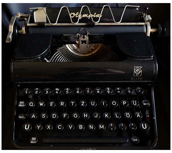
In a Facebook group (one that I suggest you don’t join), a debate has been raging for weeks over the issue of double-spacing after a full stop. Most of us know that this practice stems from the days of typewriters. With modern computer programs and fonts*, not only is it unnecessary to do this, the practice will cause problems at the formatting stage, which is why it needs to be fixed. Ahh, but try telling this to the hard-core ‘two-space’ fans (some of whom, surprisingly, don’t even appear old enough to know what a typewriter is) who have turned a simple tip thread into an acrimonious battleground.
Which brings me to the four big typographical faux pas you should assiduously avoid: double spaces after the full stop (period), double carriage returns for new paragraphs, multiple carriage returns to start a new page, and the tab key. All four are a problem when it comes to typesetting (formatting), and the first thing your editor will deal with (aka get rid of them) before they turn on track changes. They will charge you for the time to do that. Happy editor (ka-ching!) you might say, but we do appreciate getting an ms where we don’t have to do this donkey work. Here is how you, the author, can address these problems which will save you time and money down the track with both editing and formatting.
Double spaces at the end of sentences
For those who do this, it can be a hard habit to break. However, there is a simple solution. Just before you send your manuscript off to your editor hit the ‘Replace’ button on the top right-hand side of the toolbar in Word**. Place the cursor in the find box and hit the space bar twice. Then place the cursor in the replace box and hit the space bar once. Click ‘Replace All’. Voila! All fixed.
Double carriage returns
In the toolbar in the Home screen of Word you will see a long box with some type examples and a caption—‘Normal’, ‘Heading 1’, etc. These are styles. Basic text is probably using the default ‘Normal’ style (I may be misremembering but I am sure this used to be called ‘Paragraph’, why Microsoft saw the need to change the term to ‘Normal’ escapes me). Right-click on ‘Normal’, select ‘Modify’ and a dialogue box will pop up. Here you can change the font type, size, etc. by clicking on the ‘Format’ button down the bottom. Go to the ‘Paragraph’ button and in the spacing section put a number in the ‘After’ box—6pt is fine. Now you will automatically have a 6pt paragraph space after every paragraph.
Note: by setting your chapter headings to the Heading 1 style, you can create an automatic contents page.
Want a new page for the next chapter?
Go to the ‘Insert’ tab of the toolbar and click on ‘Page Break’ (keyboard shortcut CTRL+Enter).
Tabs
The most common reason authors use the tab button is probably to get an indent on the first line of a paragraph. OK, go back to where you modified your ‘Normal’ style with paragraph spacing, you will note there is an indentation section. Under ‘Special’ select ‘First Line’ and then choose how large an indent you want. This will then indent every paragraph that is set to ‘Normal’ style.
But … but… I hear you say. I don’t want the first paragraph of a chapter indented! Simple. On the far right-hand side of the style dialogue box is a 'More' button—click there and you have the option to create a style. So create a new style and call it something like ‘Opening Par’, base it on the normal style, and then modify by getting rid of the first line indent. It is then a simple matter to highlight any paragraphs that don’t require an indent and re-assign them to the style you have just created.
One more thing…
Learning how to use styles can really streamline the final formatting process. Aside from the three styles mentioned, your book might require a number of typographical elements. Some sub-headings, or a different style for depicting text messages. While some styles are default in Word (various heading levels), like the Opening Par style you made, you may have to create your own. Now, it doesn’t matter what these styles look like on your computer, 18pt Comic Sans if you like (well, maybe not), because the beauty of the system is your book designer merely needs to overwrite how you’ve designed the style with the template they create in InDesign and like programs.
*Modern fonts are proportional, so they adjust spacing. Double-spacing was used because old typewriters could only produce fixed-width, non-proportional text. A study to 'prove' that double spacing aided readability tested sixty American college students (#samplesizefail, #samplediversityfail) to see if texts with the double spacing were read more quickly. The sample group also included a high number of students who used double-spacing in their own writing.
Overall an increased speed of 3% was detected. The texts were printed in Courier, a fixed-width, non-proportional font. Where is that eye-rolling smiley?
**I am on a PC. Apple computer versions of Word may be a little different.
If you would like to comment about this post please visit my Facebook page.